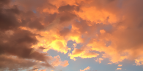
Smiling sun through clouds
Pantone has spoken today
Praying they are right
Wishing a bright and balanced future for 2021!
Giving ideas form for their function.
Smiling sun through clouds
Pantone has spoken today
Praying they are right
Wishing a bright and balanced future for 2021!
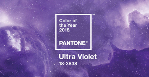
Violets are such a humble flower. And this year Pantone Color Systems have determined that we’ll be seeing Ultra Violet… well… everywhere. Violet, a deeply powerful color, helps our awareness and potential (personally and globally) soar to a whole new level. It embodies intuition and spiritual reflection – both much needed in the world today – and can help light our way to great things to come.
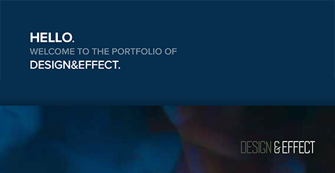
We’ve been up to creating! Explore our updated portfolio we’ve developed to quickly share recent projects, the scope of the client’s needs, and specific skills we put to use for our clients. We’ve also included some of our recent illustration and infographic work.
Let us know what you think and how we can put our skills to work for you.
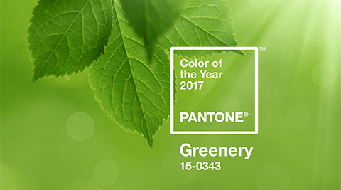
We know Pantone because we live and breathe design. Pantone is both a design and a household name thanks in part to their eagerly anticipated Color of the Year announcements.
This year Pantone searched color-use in fashion and interior design through print and web design and determined Greenery – aka Pantone 15-0343 – will be de rigueur for 2017.
Greenery can be described as a bright, yellow-green… it is a fresh, new growth green that evokes hope that springtime brings.
Green isn’t called for all in every situation, but we like the idea that we’re seeing shades of prosperity, growth, and perhaps a sense of restored balance, through the year ahead.
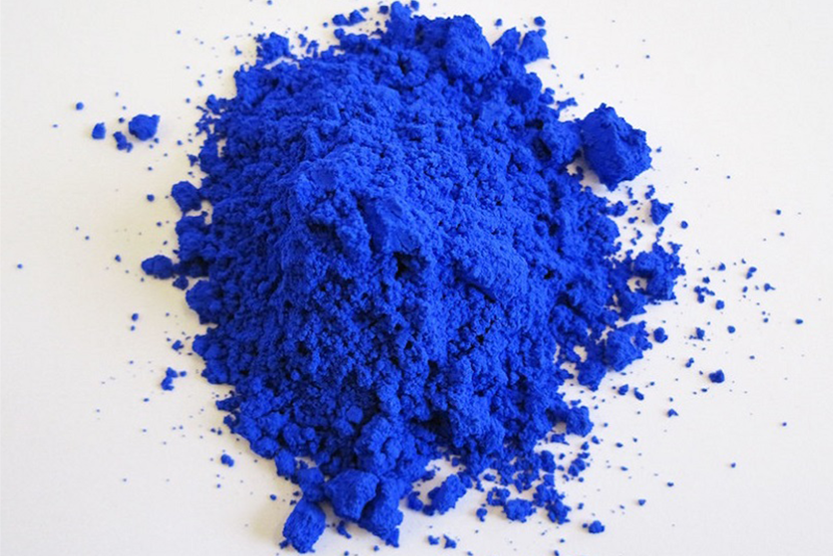
Serendipity can bring wonderful possibilities. Thus YinMn blue was born. A bright pigment that is a vivid, new shade of blue made from experiments with Yttrium, Indium, and Manganese. In addition to being a fantastic blue, the pigment may also have energy efficient applications.
Blue is a favorite color of ours… heck even Sonja’s hair is blue. And while not all our work is in blue, we strive to create pleasant surprises by blending established design concepts with the happy spark of artistic creativity. Definitely guaranteed not to give you a case of the blues.
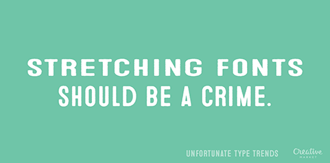
Including a new technique or style can be the proverbial ‘rug that brings your room together.’ But gimmicks usually get in the way of your message. Creative Market has pulled together their Top 6 Unfortunate Type Trends that highlights popular but egregious uses of type.
When we design your project, we employ best practices and strong design principles. We’re inspired by beautiful typography that helps your message speak clearly. Take a look at some of our recent design samples and see for yourself.
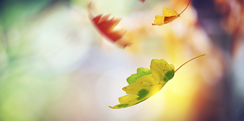
Although the weather and temperatures are still more summer than fall, yesterday a falling leaf grazed my head. Really. Leaves. Falling. In northern California.
For years fall has been a favorite season and this is why. Hot summer brings extremes… getting chilled with air conditioning or crushed with the outdoor heat. Fall brings with it balance… light and dark, heat and cool. The falling leaves are there to help remind us that something has changed. And it’s time to shift our focus.
Falling leaves in your life wake you up. It’s done it for us… now we’re ready to help add beauty, color, and connections to your next project.
On our recent tour of the western states, we drove through California’s Mojave desert. The colors of the sun, sky, and desert wove a spell in our imagination leaving us just a tad breathless.
We tend to hide ourselves from nature when it is nature that give the inspiration, the rejuvenation our souls need. Today, we’re inspired by the colors and tones, shapes and textures of nature.
What inspires you today?
Image from http://gradschoolragecomics.tumblr.com/image/40343278818
Everyone has a favorite season of the year. Mine is autumn, hands down.
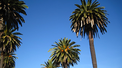
The brisk morning air, falling leaves, clear nights, and the  blue sky. The blue is deeper, richer, and makes the sky seem bigger and closer than in any other season. And somehow in contrast, every other color seems to pop and glow. The blue this time of year is so deep, it’s more feeling than simply a color.
I walk this time of year to bring a smile to my face and a bit of the sublime to my soul.
Turns out this specific Indian Summer blue really is special. Check out the explanation and science behind why we see this particular blue sky this time of year here.
Growing up in Michigan I fell in love with the autumn sky. A couple of years ago I was tickled blue to discover this rare color exists in another season – in late January and February.
This winter, take a peek at the sky when you encounter a beautiful clear day… you’ll see this intense deep blue sky again. As Indian Summer is an echo of warmer days, these winter blue skies are a promise of warmer days just round the bend.
Finding inspiration in odd moments, at odd times… it’s how to bring creativity and feeling to all we do.